Customer health score templates help customer success managers make sense of customer signals and highlight the most important, time-sensitive metrics directly on their dashboards in a context-aware manner. As customer health scores can be very complex, depending on the metrics involved in the formulas, so too can health score templates.
Join me today as I walk you through a series of customer health score templates you can steal and immediately start to use. These health scores have been sourced from real-world SaaS scenarios from a diverse range of CS use cases. They are tried and true and designed to surface hidden account details and provide visibility into corners of your SaaS you previously couldn’t see.
The following templates are divided into: classic health scores, advanced health scores, and calculated metrics. At the end, I will also include a template for your global customer health score.

1. Number of Support Cases per User Health Score Template
Tracking support tickets is common in customer success, but this health score template goes a step further by normalizing the data and removing bias.
What It Does: Tracks the average number of support cases submitted per user over the last 365 days, restricted to accounts that have at least one support ticket.
Why It Works: Normalizing by user count removes the size bias of raw ticket volume, making accounts genuinely comparable.
How to Read It: A high ratio signals friction and pinpoints whether that’s a training gap, a recurring product issue, or an account that needs a dedicated support review.

How to Set Up the Number of Support Cases per User Health Score Template
Prerequisites: product data, support software integration, total number of users in each company, total number of support tickets over the last 365 days for each company you want to track
- First, obtain the necessary data from your product and support software. You need to know how many users each tracked account has, and how many support tickets those same accounts have had in the last year.
- Next, create a metric that divides the number of support cases by the total number of users for a given account.
- Create a health score that tracks that metric for each account, and restrict the health score to only count companies that have support tickets.
- Lastly, determine health score distribution (which values are green, yellow, or red), how the health score impacts the global health score for each account, and whether you want the score displayed on the Customer Portal / Dashboard.
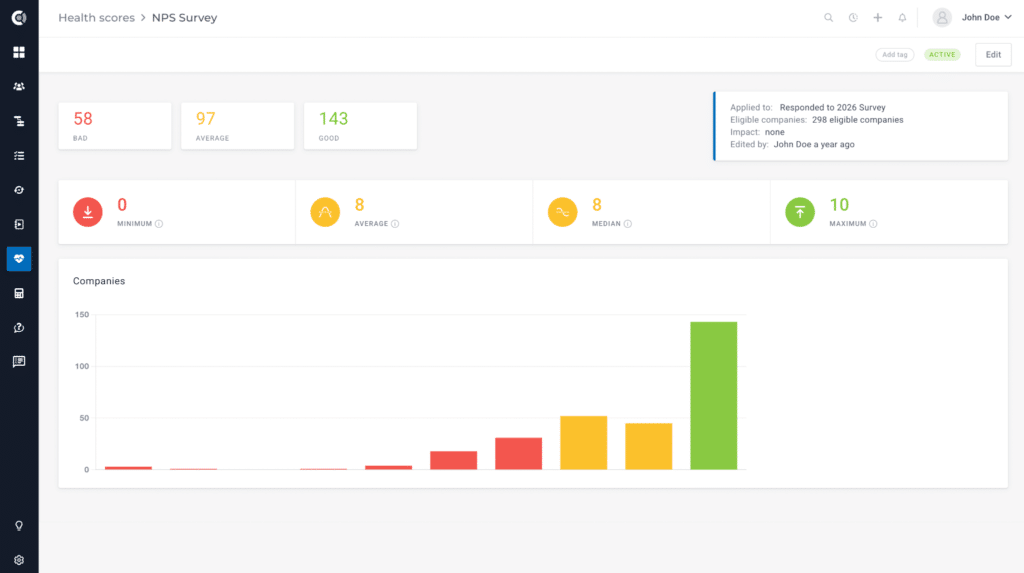
2. NPS Survey Health Score Template
A simple NPS health score template can save you a lot of time looking through survey results.
What It Does: Converts NPS survey responses into a health score signal at the account level, applied only to companies that responded to the current survey cycle.
Why It Works: Speeds up the process of reviewing NPS responses, making it easy to read straight from your customer dashboards.
How to Read It: The higher the health score, the more promoters you have (varies based on custom health score distribution setup)
How to Set Up NPS Survey Health Score Template
Prerequisites: NPS survey data
- Create and launch an NPS survey for your customers.
- Capture all the NPS responses and make sure they are passed on to your CSP (in Custify, you can do this natively or through a survey software integration).
- Create a health score that measures NPS responses, using the health score distribution to make sure Promoters show up as Green, Passives as Yellow, and Detractors as Red.
- Lastly, determine the impact on the global health score and whether you want to track NPS health scores on your Customer Portals or Dashboards.
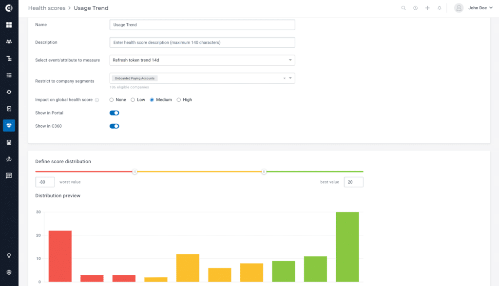
3. Usage Trend Health Score Template
Looking at how much customers use your product is simple, but doing so in a smart way is a bit more complex than you’d imagine. This Usage Trend health score template aims to fix that.
What It Does: Measures how usage is trending over a 14-day window using refresh token activity as a proxy for active sessions, restricted to onboarded, paying accounts only.
Why It Works: Measures the usage trend rather than your users’ current engagement, resulting in a more realistic view over a 2-week window.
How to Read It: Scored on a -80 to +20 scale. Positive values show good usage scores, while negative values are intentional, capturing real decline.
How to Set Up the Usage Trend Health Score Template
Prerequisites: refresh token, product data, onboarding status for tracked users, subscription data for tracked users
- Create a metric that tracks the trend of refresh token activity over the past 14 days.
- Create a health score that tracks the metric for every account, restricting it to paying companies who’ve finished their onboarding.
- Next, select the distribution. We recommend a range of -80 to 20, with positive values in the green, 0 to -50 in the yellow, and -50 to -80 in the red.
- This ensures you can distinguish between low usage and critically low usage (usually a churn precursor).
- Lastly, select how this impacts your global health score (we recommend a medium impact) and whether you will track it on your Customer Dashboard and Portal.
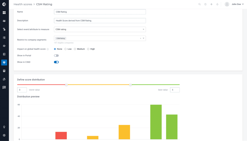
4. CSM Rating Health Score Template
Custom CSM ratings are a very useful tool for adding qualitative signals to accounts where the dashboard may not paint a full picture.
What It Does: Scores customers on a qualitative scale based on CSMs’ direct assessments of the account.
Why It Works: Captures relationship context and any soft signals that would not be picked up by other health signals or automated data pipelines.
How to Read It: Simple 1-5 scale, with 5 being the best score and 0 being the worst.
How to Set Up CSM Rating Health Score Template
Prerequisites: the ability to create a custom rating as a metric for your accounts
- Create a metric called “CSM Rating” that can be manually edited by lead account CSMs.
- Create a health score to measure that CSM rating and ensure the distribution is correctly set up (such as 5-4 green, 3-2 yellow, 0-1 red).
- Select the impact on the global health score and display the CSM Rating on your dashboard.

5. Clustered Health Scores Template
Moving on to a more advanced customer health score template, cluster health scores are a great way to build a single health indicator out of multiple signals.
What It Does: Shows a composite score built from multiple underlying health scores.
Why It Works: Cluster health scores are designed for complex scenarios where no single metric can tell the full story.
How to Read It: Cluster health scores typically have one signal that drives the score, with one or more supporting metrics that provide context and add to the math in some lesser but meaningful way. As such, reading clustered health scores will depend entirely on how you set up the impact and distribution of the underlying metrics.

How to Set Up Clustered Health Scores
Prerequisites: underlying health scores to add as components to the cluster health score
- First, write down the logic behind the clustered health score you will set up: which other health scores will make up the cluster, what impact each score will have, what the distribution will be, and how the cluster will impact the global health score.
- Next, set up the underlying health scores, if you don’t already have them.
- Then, create a custom impact or clustered health score, write a description, and select the underlying health scores that will make up the final score.
- Select the desired impact for each health score (in Custify, this can be either impact-based – high, medium, or low, percentage-based, or based on a points system).
- Determine the ideal distribution for the cluster (we recommend a 0-100 scale).
- Select the desired impact of the cluster on the global health score, and whether the cluster health score will show up on your Customer Dashboard or Portal.
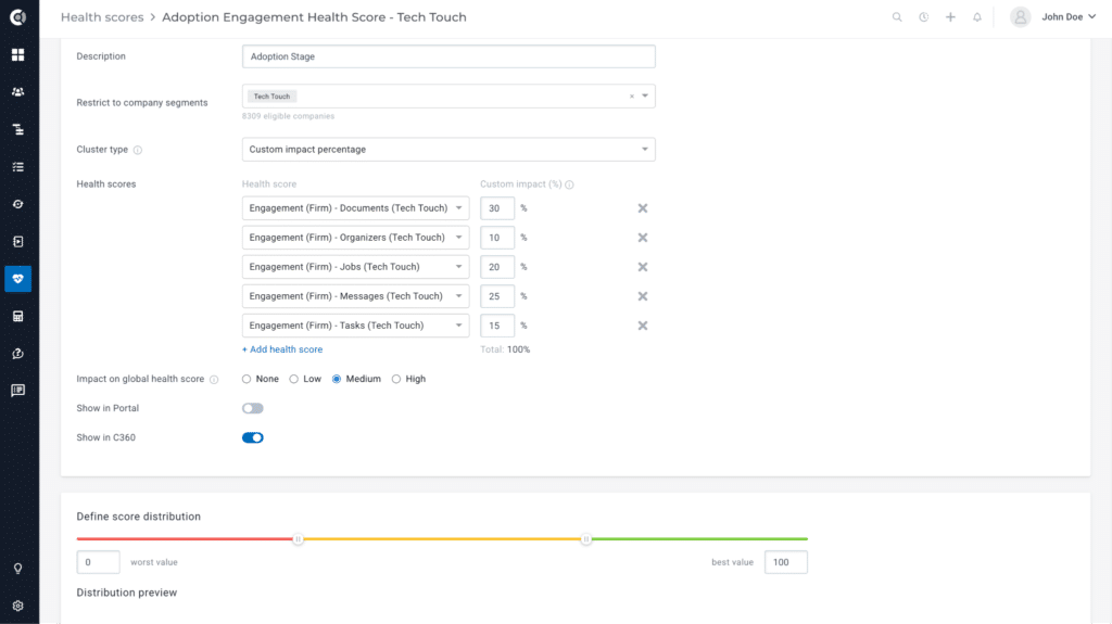
6. Complex Product Adoption Health Score Template
Let’s now look at a more specific application of a clustered health score and analyze a product adoption health score template. With this template, CSMs can effectively measure how well a company has adopted a solution or product.
What It Does: Showcases a cluster health score for product adoption, combining five feature-level engagement scores with custom impact percentages: Documents (30%), Messages (25%), Jobs (20%), Tasks (15%), Organizers (10%).
Why It Works: Combines all signals of customer activity within a typical SaaS product and returns a simple, easy-to-understand, and quick-to-read score. Demonstrates two best practices simultaneously – weighting features by business value, and maintaining separate health models for different customer segments (e.g., Tech Touch customers can have different HS measurement compared to High Touch customers).
How to Read It: We recommend setting a scale of 0-100 for distribution, with high values in the green, middling ones in the yellow, and low values in the red, making the health score easy to read.
How to Set Up a Complex Product Adoption Health Score Template
Prerequisites: product data, precise engagement health scores
- First, determine which features make the most sense for adoption. For this template, we recommend: Documents, Organizers, Jobs, Messages, and Tasks. You should also think about the impact percentage for each one.
- Create health scores for each feature, if you don’t already have them.
- Create the cluster health score as usual and select your desired feature health scores, setting your custom impact for each. We suggest:
- Documents (30%)
- Organizers (10%)
- Jobs (20%)
- Messages (25%)
- Tasks (15%)
- Determine the impact of the adoption health score on the global health score.
- Select the desired distribution for your complex adoption health score template.
- Display the health score on your customer success dashboard (recommended).

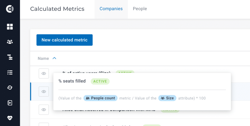
7. Percentage of Seats Filled Health Score Template
Now let’s look at some advanced metrics that can be easily converted into health scores. We’ll start with the percentage of seats filled.
What It Does: Divides the total number of seats a customer is paying for by the actual number of users and converts the result into a rate.
Why It Works: The metric turns a raw user count into an adoption rate, which is far more meaningful for renewal and expansion conversations.
How to Read It: If you have a low seat fill, it’s one of the clearest early indicators of a potential downsell or churn risk.
How to Set Up the Percentage of Seats Filled Health Score Template
Prerequisites: number of contracted sets, number of users
Health Score Formula: Percentage of Seats Filled = (Total People Count / Account Size) * 100

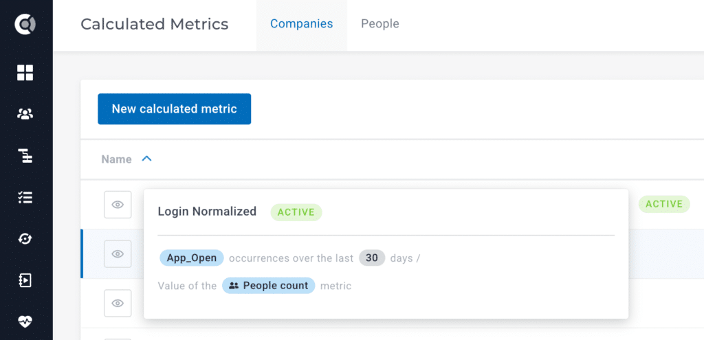
8. Logins Normalized Health Score Template
This next health score template aims to shed some light on your users’ behavior by normalizing the total number of logins.
What It Does: Divides the number of logins (App_Open events) in the last 30 days by total user count, producing a per-user login frequency, rather than an aggregate total.
Why It Works: Gives a clearer picture of logins and makes engagement comparable across accounts of different sizes. 500 logins from 50 users is a very different story from 500 logins from 1,000 users.
How to Read It: Determine an ideal number of logins per user over an average of 30 days, then read the normalized logins health score for each account as compared to that ideal number. If the number is too low, it signals a usage issue or drop. If the number is too high, it’s a clear indicator of a product issue that should be escalated to prevent skewed datasets.
How to Set Up the Logins Normalized Health Score Template
Prerequisites: login data (app_open occurrences), number of users
Health Score Formula: App Opens in the Last 30 Days / Total People Count

We had customers with several accounts marked green for months based on total event volume. Once we advised them to normalize usage metrics by active users, they realized some of their largest accounts were generating most of that activity from just a handful of power users. The rest of the seats were essentially dormant. They would have gone into renewal completely blind without this small but impactful change in the calculation formula.
– Irina Vatafu, Head of Customer Success, Custify
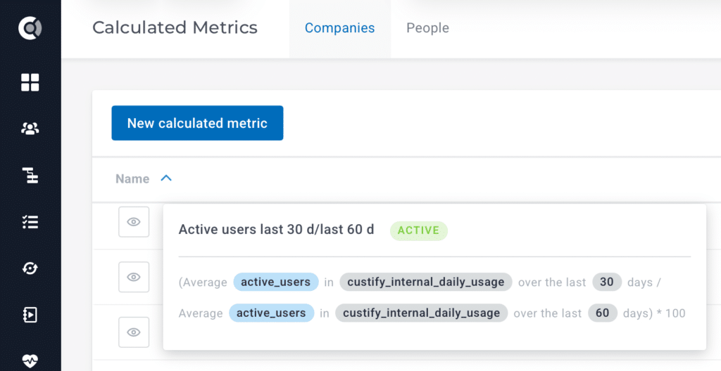
9. Active Users Last 30-Days / 60-Days Health Score Template
How is your usage trending over the last 2 months? This next health score template answers that by comparing active users in the last 30 days versus the last 60 days.
What It Does: Computes a momentum ratio by dividing average active users over the last 30 days by average active users over the last 60 days, multiplied by 100.
Why It Works: Turns a usage snapshot into a trend signal without needing complex algorithms. It’s essentially a very powerful, simple metric.
How to Read It: A result above 100 means engagement is growing. A result below 100 means engagement is declining.
How to Set Up Active Users Last 30d / Last 60d Health Score Template
Prerequisites: number of active users over the last 30 days and 60 days
Health Score Formula: Usage Trend = (Active Users Last 30 Days / Active Users Last 60 Days) * 100

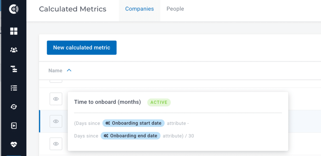
10. Time to Onboard Health Score Template
The following calculated metric measures exactly how long onboarding took for a customer (in months).
What It Does: Calculates onboarding duration in months.
Why It Works: Reflects the well-documented correlation between slow onboarding and long-term churn risk.
How to Read It: When used as a health score input with an inverted scale, longer onboarding (higher number) can be mapped to lower health.
How to Set Up Time to Onboard Health Score Template
Prerequisites: onboarding start date, onboarding end date
Health Score Formula: Time to Onboard (Months) = (Days since Onboarding Start Date – Days Since Onboarding End Date) / 30

11. QBRs over the Last 90 Days Health Score Template
The following health score template metric shows how many meetings were held with any particular customer over the last 90 days.
What It Does: Counts the number of notes tagged “Business Review Meeting” created in the last 90 days.
Why It Works: Turns executive touchpoint frequency into a trackable, scoreable metric, and instantly shows accounts with no recent QBRs.
How to Read It: Accounts with zero QBRs in a quarter have weaker relationships regardless of product usage. This calculated metric makes that visible and actionable.
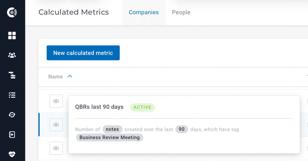
How to Set Up QBRs over the Last 90 Days Health Score Template
Prerequisites: “Business Review Meetings” tags for all customers that received a QBR
Health Score Formula: simple count of all QBRs for any particular account over the last 90 days.
I recently discussed this with a peer, who confirmed how life-changing this metric is. They assumed QBRs were happening. When they actually measured it, they found that a third of their enterprise accounts hadn’t had a business review in over 90 days. Those were also the accounts that churned most that year.
– Irina Vatafu, Head of Customer Success, Custify
12. Global Customer Health Score Template
Lastly, you will need a template for the global customer health score, which is simply an aggregate health score, or clustered health score, that measures the health of an account based on all the other health scores for that account.
What It Does: Measures customer health for an entire account through an equation that includes all other health signals as factors. Each factor in the equation is weighted based on the set impact you picked when creating the underlying scores (see formula below).
Why It Works: Since the global health score factors in all customer signals, it’s essentially the most reliable tool for gauging customer health.
How to Read It: Global health scores are usually on a scale of 0-100. You can then set the distribution according to your preference (i.e., what values are green, yellow, and red).

How to Set Up the Global Customer Health Score Template
Prerequisites: underlying health scores (usage rate, NPS health score, number of support cases per user, etc), customer success platform
- Determine which metrics will influence your global health score.
- Set the correct impact level for each underlying health score (none, low, medium, high).
- Go to your Global Health Score directly (in Custify) or create a clustered health score that includes all the underlying health scores at the set impact level.
- Define the Global Health Score Distribution on a 0-100 scale.
Summing Up
The list above includes everything you need in terms of health scoring for a more in-depth, context-aware customer success implementation. The selection lets you see your accounts with a bird’s-eye view, notice usage patterns, and identify potential friction points long before they turn into issues, downsells, and churn.
For more details on how these health scores can be implemented in Custify, set up a quick call with our team today.


![What Is Expansion MRR & How to Calculate It [Formula, Examples + Benchmarks]](https://www.custify.com/blog/wp-content/uploads/2023/06/blog-mrr_1-1.png)