Getting your website design right is important. If your company’s SaaS website design follows the main laws of user experience, it follows that your users will have a positive customer experience. This is critical, as happy customers are key to keeping repeat customers.
Where does customer success fit in? Customer success is about helping customers use your product to solve their problems. If you don’t have customers, you can’t even begin to talk about customer success in the first place. Customer success focuses on what happens after the sale.
That said, how can you create the right website design to help ensure a good customer experience and customer success? You can leverage these web design principles or laws of user experience that are based on human psychology:
1. Hick-Hyman Law
The first user experience law we’re going to discuss is the Hick-Hyman Law. In 1952, psychologists William Edmund Hick and Ray Hyman studied the correlation between the number of incentives present and people’s reaction time to any given incentive. They found that the more stimuli there were to choose from, the longer it took people to choose one.
In other words, the Hick-Hyman Law states that the time and effort your customers have to spend to make a decision increases with the number of options. If your website gives your users too many choices, it will take them longer to make a decision whether to purchase your product. Using an AI website generator can help streamline design to reduce unnecessary options.
Therefore, you should limit available options. A simple menu or a simple design choice for your subscription plans will improve CX.
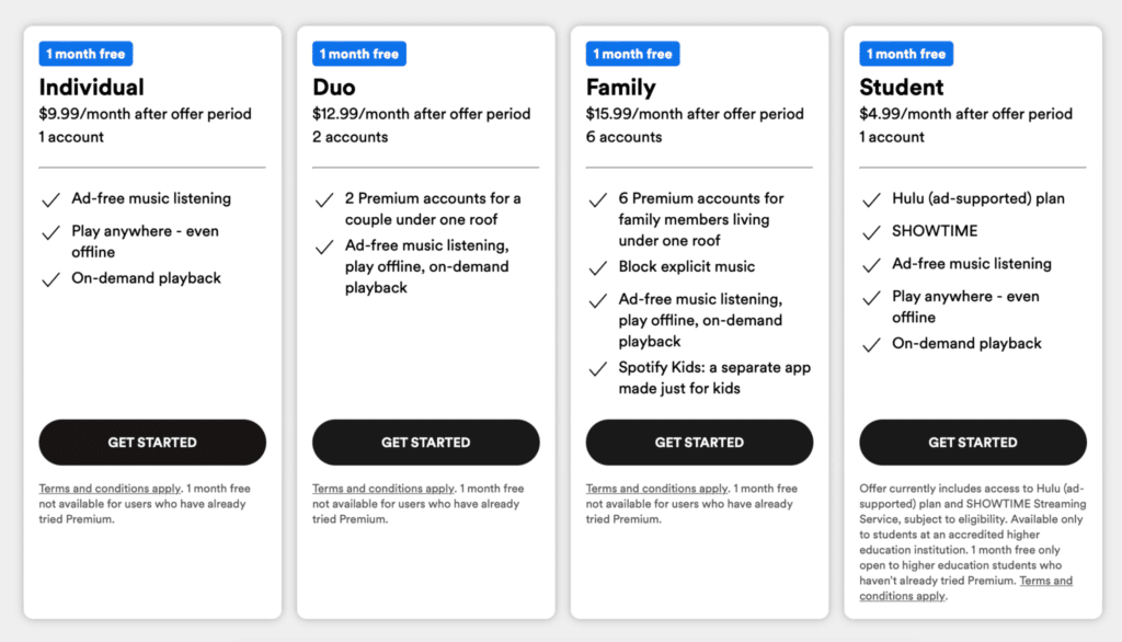
Take Netflix as an example of a SaaS company using Hick’s law on its website. Users can choose from just three plans and the differences between the plans are neatly displayed in an easy-to-read table:
You can also leverage this law by not including all your training materials on the same page. I’m not saying you shouldn’t include as many resources as possible. In fact, you should do that. Just disperse them across several pages. You want your customers to at least pick a training module. They can’t do that if there are too many training module options on a single page.
Information overload can lead customers to give up and head to your competitor’s websites.
2. The Aesthetic-Usability Effect
The Aesthetic-Usability Effect is another law worth knowing when designing or improving a SaaS website.
The aesthetic-usability effect was first studied in 1995. Hitachi Design Center researchers Masaaki Kurosu and Kaori Kashimura tested 26 variations of an ATM UI on over 250 participants. The respondents had to rate each design on ease of use and its aesthetic appeal. The study revealed that users are strongly influenced by the aesthetics of any given interface.
In other words, the first impression wins. What’s more, people can forgive small usability issues when the visual design of a website, product, or service is aesthetically pleasing.
You can also leverage this principle when including guides and training materials on your website. Teams often review these pages collaboratively, using anything from basic screenshot markups or internal design review checklists to some of the top design feedback tools for websites that support visual comments and clearer context during revisions. If the page containing these resources has pleasing designs, then customers are more likely to use these resources.
Take Stripe’s homepage as an example.
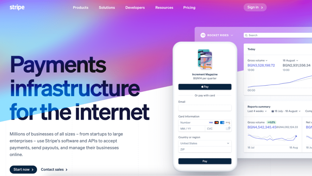
Notice that the page is eye-catching. Just look at the graphic illustration right beside it.
In practice, your website’s design and colors should match your brand book. All the pictures should communicate an authentic and great impression. Keep your site navigation simple, too.
3. Pareto Principle
One of the laws of user experience you should also consider is the Pareto Principle. The principle states that approximately 80% of effects come from 20% of the causes.
The 80/20 rule works in many aspects of our lives. For instance, in project management, the answer to the Asana versus Jira debate doesn’t really matter. Regardless of the platform you use, you may discover that 80% of project productivity comes from around 20% of the time spent on it. If you analyze your page views, you may discover that 80% of your user’s attention is spent on 20% of a web page.
Therefore, you should focus your main effort on 20% of your web page. Don’t clutter your page. That means that you’d have to choose the features that will bring the largest benefits to users and include them there. These features include your navigation menu, your Call To Action (CTA) buttons, your lead magnet, the FAQ page, or your testimonials page.
Investing in hiring professional website designers to redo your website can bring you great results in the long run. So, for example, if you’re looking for a B2B website design for manufacturing companies, choosing experts that specialize in the industry can be a good move. You’ll get a professional design based on research on what your customers need and expect within your niche. For larger organizations, it’s especially important to ensure that complex systems and workflows are intuitive for users. Using best practices in UX design for enterprise products can help streamline interactions, reduce errors, and improve overall efficiency across teams. Enterprise-focused UX strategies prioritize clarity, consistency, and accessibility to ensure that users can accomplish tasks effectively within the software environment.
4. Von Restorff Effect
The Von Restorff Effect states that when showing multiple objects that are alike, the one that stands out is the one that’s likely to be remembered. The theory, also known as the Isolation Effect, was documented in 1933 by German psychiatrist and pediatrician Hedwig von Restorff.
So, to achieve a positive customer experience, you should make the important information and key actions on your website visually distinctive during the design process.
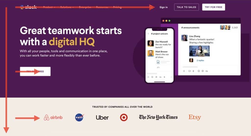
The parts of your website that need to stand out are your CTA buttons, pop-up forms, etc. Take a look at the websites of SaaS companies. These are the features that tend to have different colors. Slack, for instance, puts their CTAs in easy-to-spot boxes.
You can also make your FAQs and training resources visible on your page by making them look different. To communicate contrast, you can use different colors, sizes, shapes, or motions. At the same time, don’t overcrowd your website. You want to prevent too many design elements from competing with one another.
5. The Zeigarnik Effect
The Zeigarnik Effect is another important user experience law you should implement. The Zeigarnik Effect was discovered by Soviet psychologist and psychiatrist, Bluma Wulfovna Zeigarnik in the 1920s. It states that incomplete tasks are easier to remember than successful ones.
This law is at play when you use prompts to remind your customers about incomplete tasks on your website. Such tasks could include finishing their profile set-up, completing an order, or any other action they may have started on your website.
Grammarly is an example of a SaaS company that uses the Zeigarnik effect. Here’s a visual progress cue that motivates users to complete the installation of Grammarly on their browser.
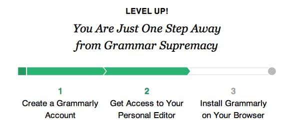
This tactic motivates users to complete the tasks. It also provides a clear indication of progress.
Your website developers can also leverage the Zeigarnik effect to encourage content discovery by providing clear signifiers of the extra content.
Use the Zeigarnik effect on your site by displaying information in little chunks, so your customers can invest time in discovering more. Link important information to sub pages on your website.
This will evoke your visitors’ curiosity. It will also help them get more details as they explore your site. In the process, they can discover products and services that are relevant to them. Customers can discover information that can help them get the most out of your products, too.
6. Serial Position Effect
Herman Ebbinghaus discovered that we tend to best remember the first and last items in a series. This is the Serial Position Effect.
Online users consume website content in a zigzag layout, a Z pattern, or an F pattern. This is why vibe design—where the overall feel and flow of a page shape how users move through it—matters so much when deciding what goes where.
Just to give you an idea, here’s what the zigzag layout looks like:
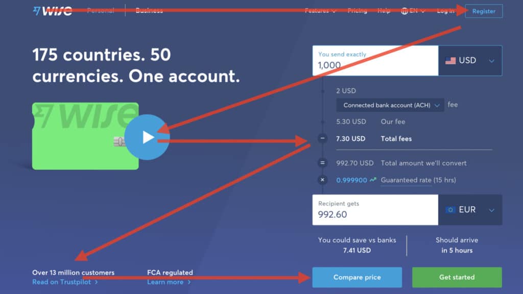
Source: Transferwise Website
Meanwhile, here’s the Z layout:
Finally, here’s the F-pattern:
So, placing important information at the start and at the end of those patterns can help bring this information to users’ attention.
Position your website’s key actions on the far left and right in the navigation menu to allow for memorization.
Place the Home button at the top, and the Contact Us button at the end. The least important items can stay in the middle of the list.
7. Picture Superiority Effect
The Picture Superiority Effect simply states that people remember pictures better than words. To achieve a fantastic customer experience and help ensure customer success, businesses should communicate with website visitors through images.
For instance, you should present complex topics through charts and animated infographics. As people tend to remember faces and indoor scenes, you should use them over images of outdoor landscapes.
The picture superiority effect should be used in branding. Show your customers your face. Chances are, people will remember your face over your name or your brand’s name. If people can recognize you through a picture, you have managed to market your brand successfully. You can also help clients trust your brand.
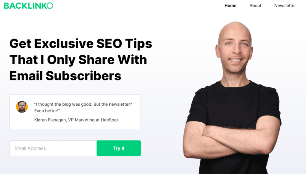
Brian Dean, the SEO guru of Backlinko, uses picture superiority effects throughout his website. His smiley face appears on almost every page of his website.
Your blog readers are more likely to remember an article’s featured image over its title. Thus, you should choose images that are professional and memorable. Using tools like an AI image generator can help create unique visuals that stand out.
Also, if you’re offering a lead magnet, such as an ebook, you should choose an image and consistently use it across all your marketing channels.
The bottom line, communicate with your audience through images so people can remember you.
In Closing
Businesses following the laws of user experience in their website design decisions use psychology to create positive experiences for their customers. When you ensure a great customer experience, you pave the way for customer success, too.
So, when working on improving your website design, leverage the following laws of user experience:
- Hick’s Law
- The Aesthetic-Usability Effect
- Pareto Principle
- Von Restorff Effect
- The Zeigarnik Effect
- Serial Position Effect
- Picture Superiority Effect
Use a simple design. Make sure you make a great first impression, too. Don’t overcrowd your website. Focus on the most important 20% of the page. You should make your key elements stand out — especially if they are the first and last parts of a series.
Also, use prompts to remind customers of incomplete tasks. Finally, use images to communicate with your site visitors.