A customer-facing knowledge base (KB) isn’t a static FAQ archive; it’s a core product surface that shapes onboarding, adoption, and retention. When the KB’s UX/UI is intentional, it becomes a self-service engine that reduces effort, speeds time to value, and quietly builds trust at scale.
This guide breaks down the UX and UI decisions that turn a KB into a durable growth lever, spanning information architecture, search UX, article design, measurement, and continuous improvement, so Customer Success, Product, and UX teams can work from a shared playbook.
New to knowledge bases? Start with our foundational guide to building a KB, then use this UX playbook to level it up
Strategic Value: Deflection, Speed, and Confidence
Why design quality matters
Deflection: If customers can self-serve, they won’t file tickets. That frees Support to focus on high-value cases.
Time to Value (TTV): The faster users unblock themselves, the sooner they activate, adopt, and expand.
Confidence & loyalty: Consistent, accurate help builds product trust. Trust drives retention.
A quick scenario
A new user hits a snag while configuring an integration that touches media workflows and asks how to best process large images.
A great KB:
- surfaces the right article via query suggestions (“bulk resize,” “optimize images”);
- shows annotated steps and a 45-second GIF; and
- links out to relevant conceptual help (e.g., a primer on evaluating image editing software to set expectations).
Micro-caselet: When Shopify embedded contextual help widgets and product-specific guides via Zendesk, they reduced ticket volume by 22% and improved agent efficiency.
The result: no ticket, faster value realization, and a bump in perceived product quality.
Designing for Delight (and Efficiency)
Information Architecture (IA): Make Complexity Legible
Treat IA like product navigation. Your goal: minimize cognitive load and help users follow intent-driven paths.
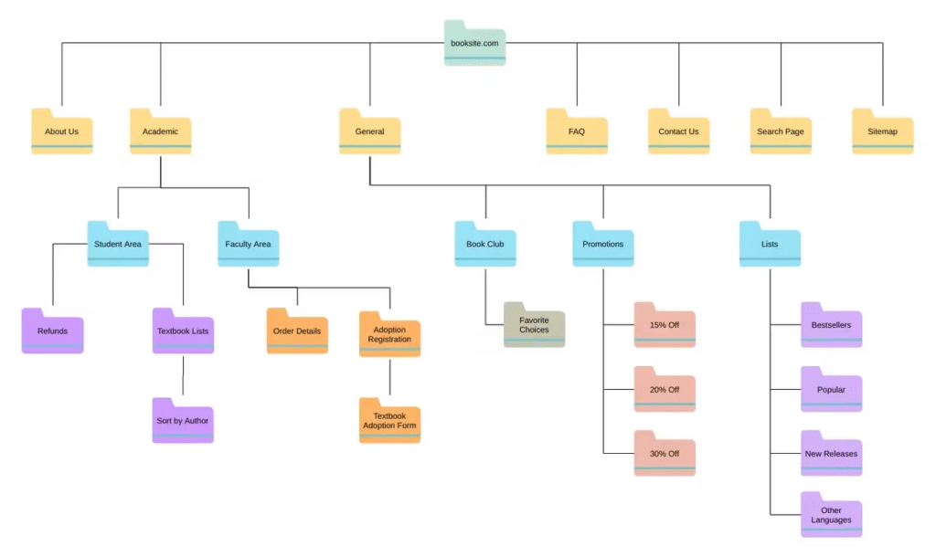
Principles
- Task-first, not org-first: Prefer “Getting Started,” “Build,” “Automate,” “Secure,” over internal team names.
- Progressive disclosure: Move from broad to specific (Category → Subcategory → Article).
- Cross-linking: Every article suggests next steps (“Related tasks,” “Prerequisites,” “Troubleshooting”).
- Dual pathing: Provide both journeys (“Onboard my team”) and objects (“Integrations,” “Billing”).
IA techniques
- Card sorting to discover user mental models.
- Tree testing to validate findability.
- Content types taxonomy (how-to, concept, reference, troubleshooting) to standardize scope.
Micro-caselet: The Atlassian design team ran a remote card sort and tree test to reorganize their documentation IA. The result: faster navigation, fewer “no results” searches, and measurable gains in self-service success.
Design parallel
Good IA mirrors custom website design: clear hierarchies, predictable patterns, and labels that reflect user language, not internal jargon.
Help Center Search UX: Autosuggest, Facets, and Relevance
Most users will search first. Treat search like a product with its own backlog.
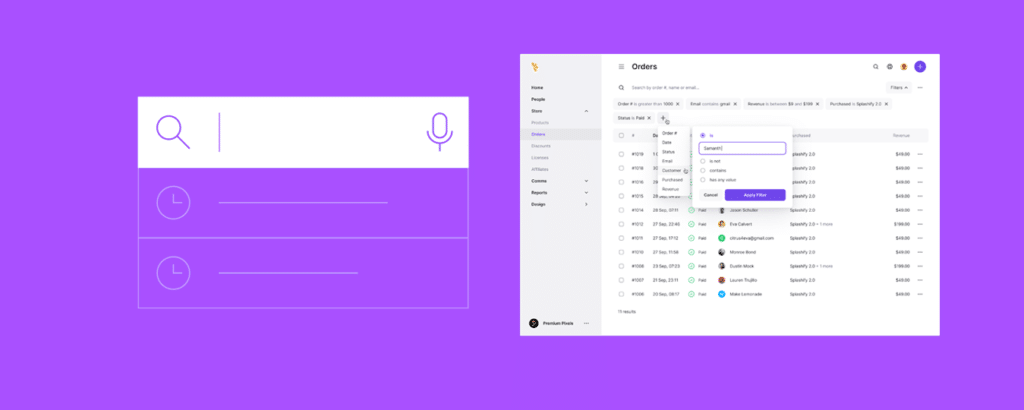
Must-have capabilities
- Autosuggest & synonyms (“SSO,” “single sign-on,” “Okta”) with typo tolerance.
- Facets/filters (product area, role, difficulty, content type).
- Result previews with query highlights to set accurate expectations.
- “No results” states that offer spelling fixes, broader terms, or a guided form.
Ranking signals to consider
- Click-through rate and dwell time on articles.
- Freshness (recently updated content ranks higher).
- Helpfulness score (thumbs up/down).
- Role/plan targeting (admin vs. end user).
Instrumentation
Log search query, filters, session role, zero-result events, and clicked result IDs. Push to your analytics warehouse for cohort analysis (e.g., first-week users vs. power users).
Micro-caselet: Using query logging and “no results” tagging, Slack’s help team discovered users still searched using deprecated UI terms—insights that drove a taxonomy update improving findability.
Self-Service UX: Articles That Actually Deliver
A findable article that doesn’t solve the problem is still failure. Design the article experience with the same care you’d give product UI. For a truly exceptional user experience, many companies partner with a specialized UX UI design agency, like Excited Excitedand other.
Article template (recommended sections)
- Problem statement (one sentence): “Bulk import fails at 10,000 rows.”
- Before you begin: prerequisites, permissions, environment.
- Step-by-step (numbered, one action per step).
- Expected result after each step (so users can self-check).
- Visuals: annotated screenshots or short GIFs; captions clarify what changed.
- Variations (OS, plan, role) and edge cases.
- Related tasks and concept links.
- Feedback control (Was this helpful? What was missing?).
- Metadata: last updated, author/owner, version, product area.
| wdt_ID | Section | Purpose | Example |
|---|---|---|---|
| 1 | Problem statement | Defines the issue clearly in one sentence | “Bulk import fails at 10,000 rows.” |
| 2 | Before you begin | Lists prerequisites, permissions, and setup | “Admin access required; upload limit = 15MB.” |
| 3 | Steps (numbered) | Guides users through the workflow with one action per step | “1. Click Upload → 2. Select file → 3. Confirm batch.” |
| 4 | Expected result | Helps users verify success after each step | “Upload confirmation message appears.” |
| 5 | Visuals (optional) | Clarifies complex steps visually | Annotated screenshot or 30s GIF |
| 6 | Edge cases / variations | Prevents user confusion in alternate contexts | “On macOS, use ⌘ instead of Ctrl.” |
| 7 | Feedback control | Collects real-time user input on helpfulness | “Was this helpful? [Yes / No]” |
Microcopy & formatting
- Aim for a grade 7–9 reading level.
- One instruction per step, verb-led (“Click Upload,” “Select Team → Members”).
- Place warnings inline at the relevant step, not at the end.
- Provide keyboard and UI paths (Menu → Settings → Billing).
Visual guidance
When a workflow involves media, show it: a short looped GIF demonstrating a resize, crop, or export step beats 300 words. If users need to evaluate tools, link a credible primer on image editing software for context.
Accessibility
- Alt text for all images.
- Avoid color-only cues; pair with icons/labels.
- Ensure focus order and heading hierarchy are logical.
In-Product Surfacing: Bring the KB to Where Work Happens
Great KBs don’t live only on a docs domain.
- Contextual help: Inline “?” icons and “Learn more” links point to exact anchors, not the KB home.

Example from Salesforce’s KB. - Command palette / quick help: Let users open help via keyboard and search within the current screen’s scope.
- Empty states & errors: Offer the precise article that resolves the state, not generic docs.
- Onboarding checklists: Pair steps with the canonical KB how-to.
Personalization: Role, Plan, and Lifecycle
- Role-aware: Admins see configuration and governance; end users see task execution.
- Plan-aware: Hide or flag features behind higher tiers; avoid dark patterns—be explicit (“Available on Pro+”).
- Lifecycle-aware: First-week users get foundational guides; returning users see advanced patterns.
Localization & Global UX
- Translate high-value pathways first (onboarding, billing, auth).
- Provide language toggles that persist session-wide.
- Mirror layouts appropriately for RTL languages.
- Maintain screenshot parity; mismatched UI erodes trust.
- Localize search (synonyms and stemming per language).
Governance: Ownership, SLAs, and Versioning
Treat the KB like a product with its own operating model.
- Ownership: Every article has a DRI (directly responsible individual).
- Update SLAs: e.g., 72 hours for critical changes; monthly refresh for top 5% traffic.
- Docs-as-code: Use PRs, reviews, and CI checks (lint for broken links, alt text, reading level).
- Changelog hooks: Product release notes trigger article audit tasks.
- Deprecation policy: Archive with banners; keep SEO equity but prevent outdated guidance.
Measure Self-Service ROI: SSR, Deflection, TTV
Stakeholders will ask: “Is it working?” Answer with a compact, trustworthy metrics stack.
Core metrics & formulas
- Self-service rate (SSR)
SSR = Self-resolved sessions ÷ (Self-resolved + Contacted Support)
Target range for mature SaaS: 60–85%. - Deflection rate
% of support-intended sessions that did not submit after consuming KB content. - Time to Value (TTV)
Time from signup to first activation. Compare cohorts with/without KB exposure. - Article helpfulness
Upvotes ÷ (Upvotes + Downvotes); pair with “What was missing?” feedback. - Search success
% sessions with query → result click → dwell ≥ X seconds and no ticket. - Attribution model
Session-level journeys (Product → KB → Product) with 24-hour lookback.
Give assisted resolution credit if a KB view occurs within N minutes before a successful task.
Micro-caselet: After linking analytics to article metadata, one team discovered that refreshed how-tos directly correlated with a 12% boost in user activation rates.
Wire It to Custify
Connect your KB analytics to Custify to visualize how support deflection and self-service correlate with retention, expansion, and health scores. By integrating SSR and helpfulness metrics directly into customer health dashboards, CS teams can identify which segments benefit most from improved documentation and proactively close gaps before churn risk appears.
Connect your KB analytics to Custify so self-service signals actually drive action—not just reports.
What to ingest
- Self-service rate (SSR), article helpfulness, “no results” queries
- Search terms → clicked article IDs → dwell time
- Ticket intent impressions vs. submissions
How it flows
- Pipe SSR, “no results,” and helpfulness into segment health scores.
- Trigger playbooks when thresholds dip (e.g., SSR −10% WoW, high “no results” for “SSO setup”).
- Auto-assign tasks to owners (Docs, CS, or Product) with the article/query attached.
- Notify CSMs in Slack/Email when a segment’s help signals worsen.
- Show impact in QBRs via a shareable Custify portal tile: “Docs fixes → ↓ tickets, ↑ activation, ↑ health.”
Example playbook
- If: “no results” contains billing address OR tax invoice for 7 days
- Then: create Doc request → publish article → in-app tip to affected segment → re-score health
KPIs to track in Custify
- Deflection rate by segment after doc updates
- Activation TTV delta for users who viewed updated articles
- Health score lift (±) within 14–30 days of KB changes
- Tickets per 1k sessions for tagged topics (pre/post)
Common KB Anti-Patterns to Avoid
- Org-centered IA (menu mirrors your teams, not user tasks).
- Walls of text; no numbered steps or expected outcomes.
- Out-of-date screenshots; mismatched UI labels.
- PDF attachments as your “docs.”
- Hiding support entry points to “force” deflection (backfires; erodes trust).
- No owner/last-updated metadata (users can smell stale content).
Always Improving: The Evolving Knowledge Base
Feedback loops
- Inline “This fixed it / Not yet” buttons with a one-line free text field.
- CS and Sales “tribal knowledge” pipeline into content requests.
Experimentation
- A/B test titles, first-paragraph clarity, and image placement.

Source: Intelligentreach - Test alternative structures for long procedures (accordion vs. short multi-page flows).
Content decay prevention
- Auto-flags on schema changes, permission updates, and UI diffs.
- Quarterly “Top Workflows” review sprints by product area.
FAQ
1. How do you measure KB effectiveness?
Blend SSR/deflection, search success, helpfulness, and TTV deltas. Use cohorts (new vs. returning, admin vs. end user) to spot where the KB moves the needle.
2. What makes a good KB article template?
A crisp problem statement, prerequisites, numbered steps with expected outcomes, visuals (screenshots/GIFs), edge cases, related links, feedback control, and visible metadata (owner, last updated).
3. KB vs. product docs vs. community – when to use each?
- KB: Task-focused, outcome-oriented, optimized for speed and scannability.
- Product docs: Deep technical reference (APIs, schemas, limits).
- Community: Workarounds, peer-to-peer tips, and shared best practices.
4. What’s a good S2C (self-to-contact) benchmark?
Context-dependent. For self-serve SMB SaaS, 70–80% self-resolution is typical; for enterprise, 50–65% may be healthy due to higher complexity.
5. How often should we review articles?
Continuously for top-traffic paths; at least quarterly for the broader corpus, and immediately after UI or policy changes. Use ownership and SLAs to enforce this.
Build Loyalty with Smart Design
A great knowledge base is a customer experience multiplier. With clear IA, reliable search, accessible and visual articles, and a governance model that keeps content fresh, your KB reduces effort, lifts activation and adoption, and compounds retention.
Treat KB work with the rigor you’d apply to custom website design: understand intent, design for flow, and validate with data. When users need deeper learning, borrow from instructional design for eLearning to structure multi-step training. And when your product touches creative workflows, anchor guidance with pragmatic references to image editing software so users can make informed choices.
Do this well, and your KB stops being “documentation” and becomes an elegant, always-on extension of your product, one that quietly earns trust, deflects tickets, and keeps customers coming back.